How to Use the Admin Dashboard
Learn how to analyze your archive's performance and understand user engagement patterns through interactive data visualization and flexible time-based reporting.
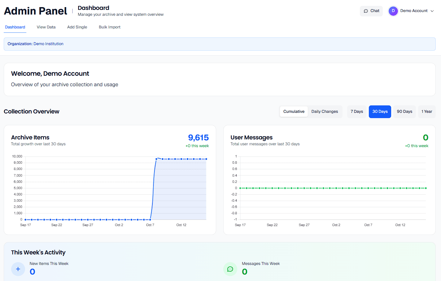
Getting Started
When you first access the admin dashboard, you'll see a personalized welcome message followed by two main analytical views: your archive collection growth and user engagement metrics. The dashboard is designed to give you both high-level insights and detailed trends to help you understand how your archive is performing over time.
Understanding Collection Growth
The blue-themed chart shows how many items have been added to your archive, helping you track digitization progress and identify busy periods of content addition.
Measuring User Interest
The green-themed chart tracks how often users interact with your collection through searches and conversations, indicating which content resonates with researchers.
Customizing Your Data View
Choosing the Right Time Perspective
The dashboard offers four time range options to help you analyze different aspects of your archive's performance. Each time range serves a specific purpose in understanding your collection's trajectory.
When to Use Each Time Range
7 Days: Perfect for monitoring recent activity, tracking the immediate impact of new content additions, or checking daily engagement patterns after promotional activities.
30 Days: Ideal for monthly reporting, identifying weekly patterns, and understanding short-term trends in both collection growth and user interest.
90 Days: Excellent for quarterly reviews, spotting seasonal patterns, and evaluating the sustained impact of major collection additions or outreach efforts.
1 Year: Essential for annual reporting, long-term strategic planning, and identifying broader trends that inform collection development priorities.
Understanding Chart Modes
Cumulative vs. Daily Changes
The dashboard offers two ways to visualize your data, each revealing different insights about your archive's performance. Understanding when to use each mode will help you extract the most meaningful information from your analytics.
📈 Cumulative View: Seeing the Big Picture
Use cumulative view when you want to understand overall growth trends and see how your archive has expanded over time. This smooth, ascending line chart is perfect for:
- • Demonstrating progress to stakeholders and funders
- • Setting realistic goals for future digitization projects
- • Identifying periods of sustained growth or stagnation
- • Understanding the long-term trajectory of your collection
📊 Daily Changes: Spotting Patterns and Anomalies
Switch to daily changes when you need to identify specific patterns, busy periods, or unusual activity. This bar-style chart reveals day-to-day variations and is ideal for:
- • Identifying which days of the week are most productive for content addition
- • Spotting unusual spikes in user engagement after events or publicity
- • Planning staffing and resources around peak activity periods
- • Troubleshooting periods of unexpectedly low activity
💡 Pro Tip: Switch Between Views
Start with the cumulative view to understand overall trends, then switch to daily changes to investigate interesting periods more closely. The charts update instantly, so you can easily compare the same data from both perspectives.
How to Read Your Analytics
Interpreting Collection Growth
The blue Archive Items chart shows how your digitization efforts are progressing. Each point on the line (or bar) represents either your total collection size or daily additions, depending on your selected view mode.
📊 What to Look For
Steady upward trends: Indicate consistent digitization work and good workflow processes.
Steep increases: May represent bulk imports, special projects, or increased staffing.
Flat periods: Could signal holidays, equipment downtime, or resource constraints.
Irregular patterns: Might reflect seasonal work patterns or project-based digitization.
🎯 Using This Information
For Planning: Use consistent growth rates to predict completion dates for digitization goals.
For Reporting: Highlight successful periods in grant reports and board presentations.
For Troubleshooting: Identify periods of low productivity and investigate causes.
Understanding User Engagement
The green User Messages chart reveals how actively researchers are using your collection. This includes all interactions through the chat interface and search features, giving you insight into which content resonates with your audience.
� Reading Engagement Patterns
High message volume: Indicates strong user interest and active research happening with your collection.
Spikes in activity: Often correlate with new content additions, promotional activities, or academic calendar events.
Consistent baseline activity: Shows sustained interest and suggests your content is meeting ongoing research needs.
Correlation with collection growth: Look for how new additions impact user engagement over time.
Making Data-Driven Decisions
Using the Activity Summary Cards
Below your charts, you'll find two summary cards that provide quick, contextual snapshots of recent activity. These cards automatically adjust their time descriptions based on your selected date range, giving you the most relevant recent activity metrics.
📚 Archive Items Summary
This card shows recent additions to your collection with context-aware time periods. Use it to quickly assess recent productivity and communicate current digitization pace.
7 days: "Total archive items added" - Perfect for weekly reports
30 days: "Archive items added this week" - Good for monthly reviews
90 days: "Archive items added in the last 2 weeks" - Ideal for quarterly updates
1 year: "Archive items added this month" - Great for annual planning
💬 User Messages Summary
This card tracks user interactions using the same smart time periods. High numbers indicate strong engagement, while trends over time show whether interest is growing.
Regular monitoring: Check weekly to understand baseline engagement
After new additions: See if fresh content drives increased interest
Seasonal patterns: Academic calendars often influence research activity
💡 Strategic Questions to Ask
• Productivity: Are we digitizing items at a sustainable pace?
• Impact: How does new content affect user engagement?
• Resource allocation: Should we adjust staffing during peak engagement periods?
• Content strategy: Which types of additions generate the most user interest?
Troubleshooting and Best Practices
Common Scenarios and Solutions
⚠️ Charts Not Loading
If you see loading indicators that don't resolve, or if charts appear empty:
- • Check that you're signed in with administrative privileges
- • Try refreshing the page to reload dashboard data
- • Switch to a different time range to see if data exists for that period
- • Verify that your archive contains items or has recorded user activity
📊 Maximizing Chart Insights
To get the most valuable insights from your dashboard:
- • Hover over chart points to see exact dates and numbers
- • Compare the same time periods in both cumulative and daily change modes
- • Look for correlations between collection growth and user engagement spikes
- • Use longer time ranges to identify seasonal patterns in your data
🎯 Regular Monitoring Tips
Establish a routine for checking your dashboard effectively:
- • Weekly: Check 7-day view for immediate trends and current productivity
- • Monthly: Review 30-day patterns to inform short-term planning
- • Quarterly: Analyze 90-day trends for strategic decision-making
- • Annually: Use 1-year view for comprehensive reporting and goal-setting
Advanced Usage Strategies
Combining Data Views for Deeper Analysis
The most valuable insights often come from comparing different views and time ranges. Here are some proven strategies for extracting maximum value from your dashboard data.
📈 Trend Analysis Workflow
- Start with 1-year cumulative view to understand overall trajectory
- Switch to daily changes to identify patterns and anomalies
- Zoom in to 90-day periods around interesting events
- Use 7-day view to examine specific weeks in detail
🔍 Impact Assessment Method
- Note dates of major collection additions or promotions
- Check user engagement in the weeks following these events
- Compare engagement patterns before and after changes
- Document successful strategies for future reference
🚀 Pro Tip: Create Your Own Reporting Rhythm
Establish regular check-ins with specific goals: Monday mornings for weekly productivity review, month-end for stakeholder updates, and quarterly deep-dives for strategic planning. This routine ensures you're always informed about your archive's performance and ready to make data-driven decisions.